Spaceships Font


The Project
A Type West 2025 project, this typeface was the original typeface created for the program. The project consisted of the following deliverables:
Feel free to check out this project on Type West’s Website.
3 font axis of a single family
A process book set in the font
Hand outs for the in-person exhibition.

The term “Spaceships” is a sticky one in my household. My husband is an aerospace engineer and I like to tell other people that he works on “spaceships” only to be corrected that they are “space vehicles.”

After doing the initial sketch I created several sketch iterations of the text, including a lighter weight and a rounded version.
The font was inspired by a type cooker I did for class. A type cooker is a recipe for a font sketch to provide technical limitations for the design.
My type cooker recipe was as follows:
Construction: Roman
Stroke Endings: Straight, no serif
Contrast Type: Expansion
(the contrast produced by a flexible or pointed nib pen)
Weight: Black
Contrast Amount: Some Contrast
Width: Slightly wide
The Process
Over the course of two semesters in Type West 2024, I created dozens of versions of the font. Eventually the font became different from the initial sketch, although its quirky personality remained consistent. Certain letters underwent more changes than others.
As I created multiple masters the font changed further and presented more challenges. I had to change the stem width and overhaul the font multiple times. The diacritics, punctuation, and numbers also proved to be very challenging with such a personable typeface.

The evolution of the font, from the original digitization to the final version.

Various letters went through major changes in the font.
The 3 masters I created was the original extra bold, a medium weight and an italic weight. The extra bold and medium weights were on a variable axis, so they could be interpolated.
The final book is located at the Letterform Archive in San Francisco and the project was supervised by Maria Dourelli of Contrast Type Foundry.


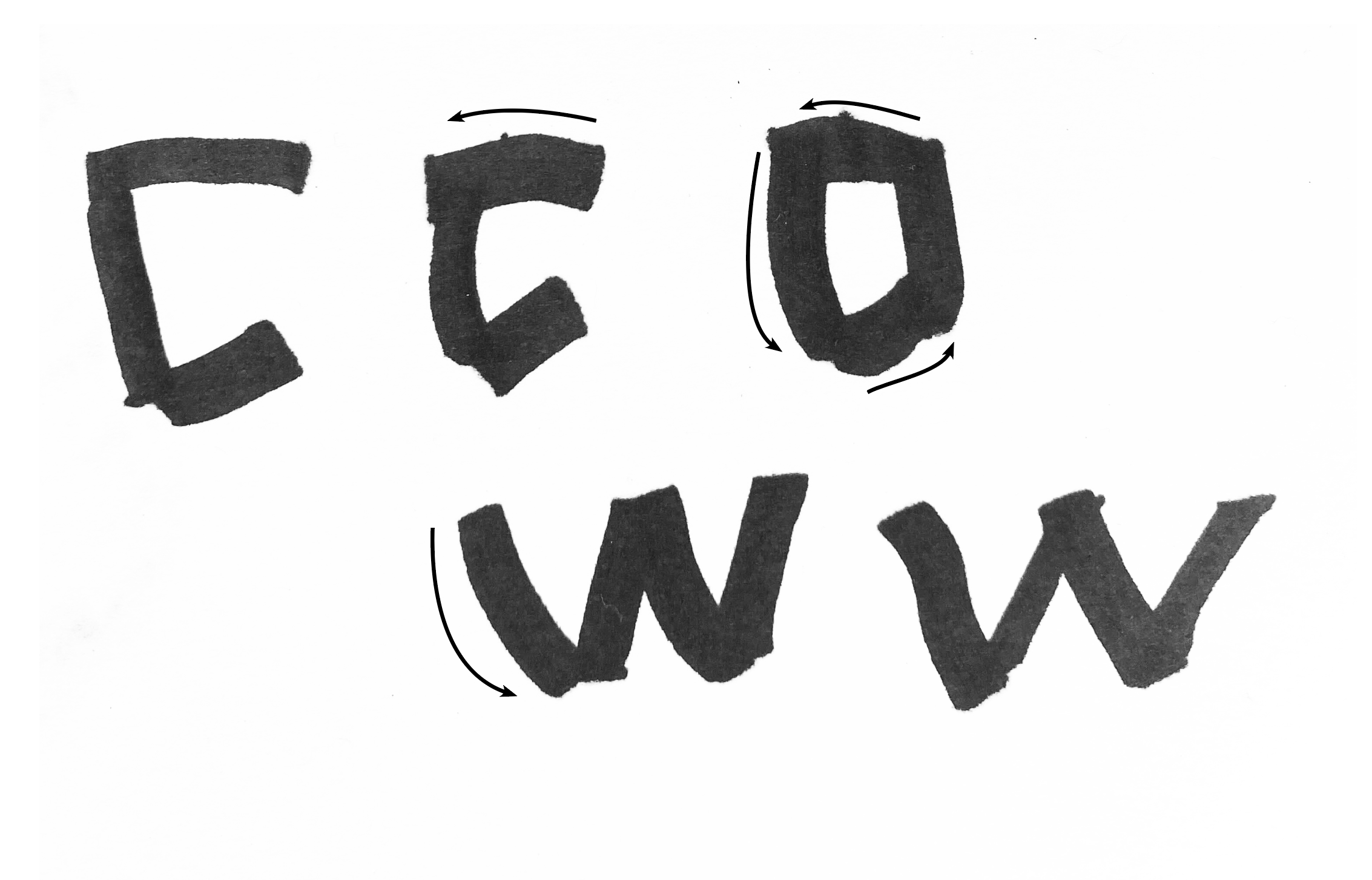
Testing handwritten construction of the letters was very useful to figure out the system.


Interpolation between the regular and bold weights on a variable axis.
Below you can find the full set of characters for all three masters, including those supporting additional languages. The presentation of the font was based off of my husband launching his project at work and my “launching” of the Spaceships font at the same time.


